UP-ROOT
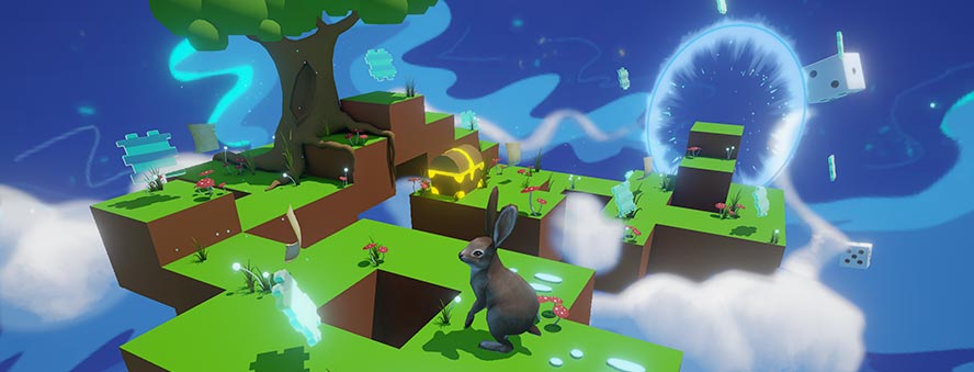
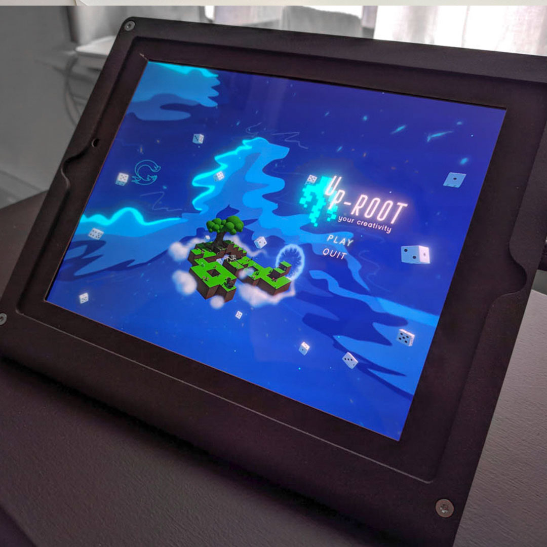
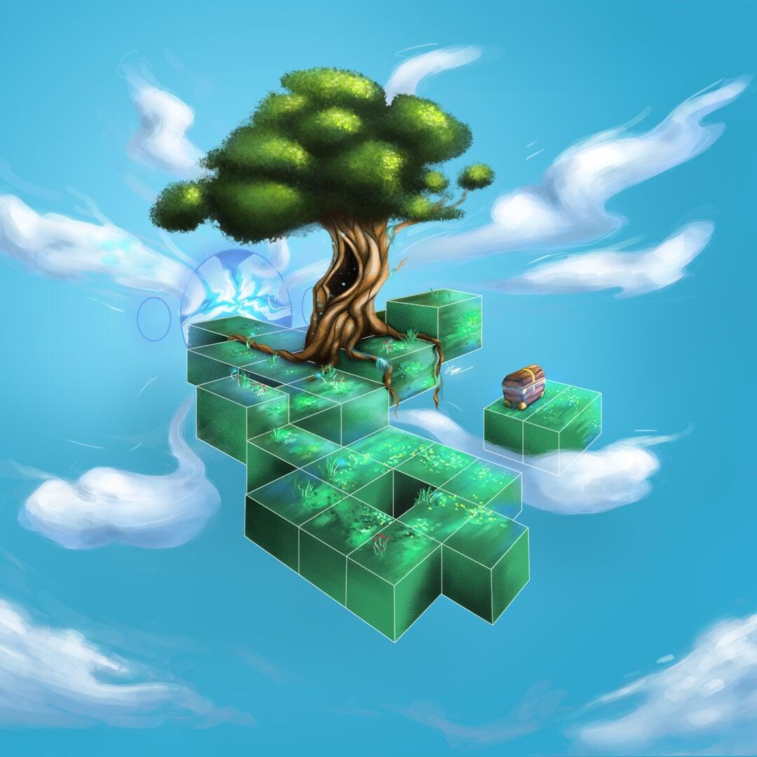
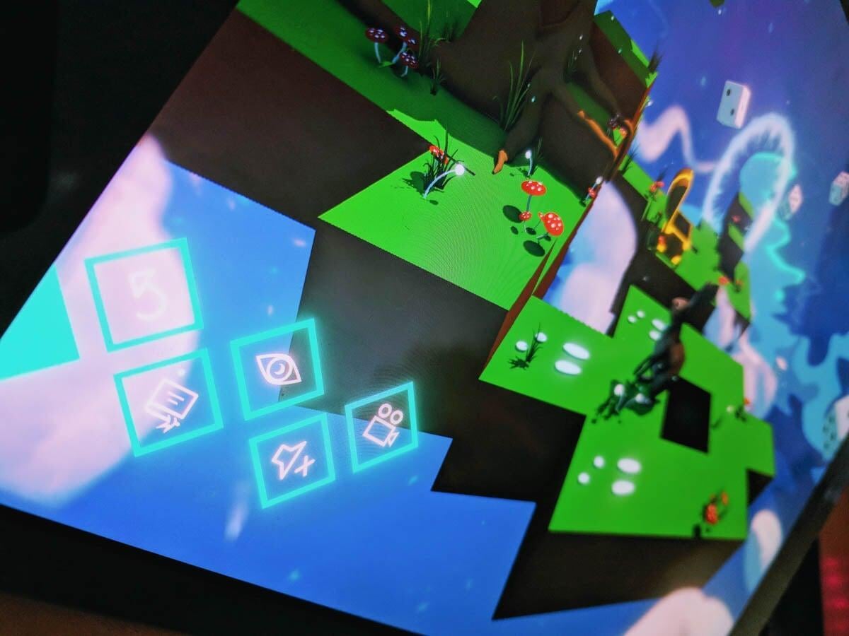
My mission was to make creativity approachable again. In this commercial world, creativity has almost become a production factory. Because of this pressure people who think they aren’t creative, might not start on something at all. I also wanted to take creative people out of their daily pattern. That's why I developed a game (together with my brother) which can be played on a tablet.
The goal of the game is to spend a little bit of time each day doing a creative assignment. So when the bunny is moved one step forward a screen will pop-up with instructions. There are five assignment category’s in total (motivation, vision, skill, curiosity and interaction) and vary from sketch to psychological assignments.
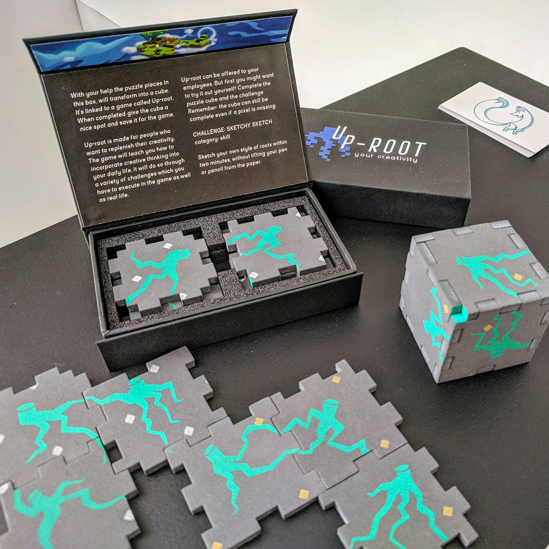
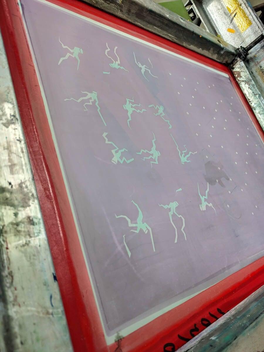
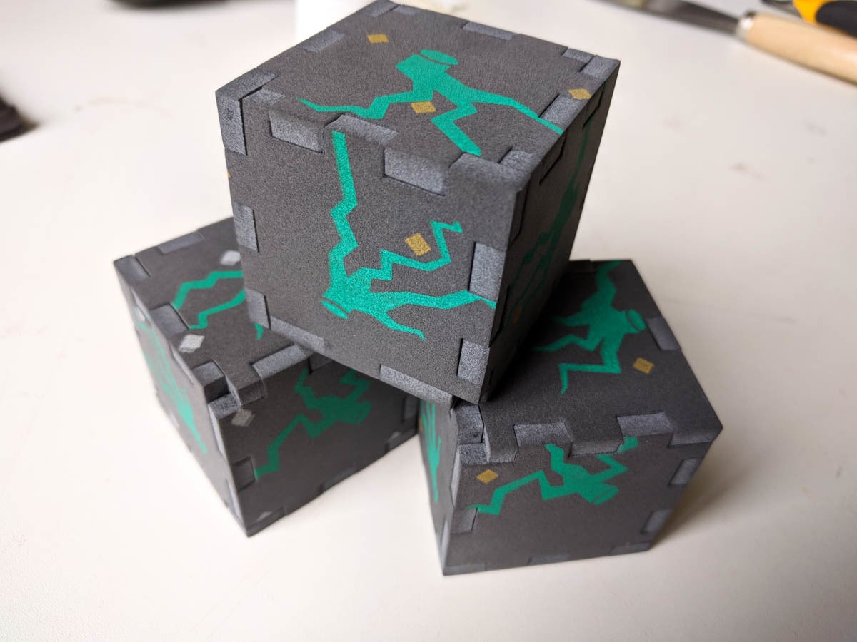
The game is offered as a training for personal of basically any company and starts with a puzzle cube. The pattern on the cube is a second puzzle at the end of the game. The game has a total of forty challenges and takes forty days to complete. The knowledge gained from the game can then be submitted into real life, so people don’t need the game anymore to do small creative things every day.
CREATIVITY INC.
The main question of my thesis is: How can I, as a Graphic Designer fully use my creativity in the context of commercial based assignments. The research I conducted to find the answer was very exciting and fun.
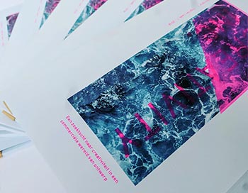
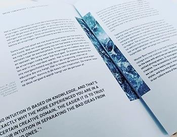
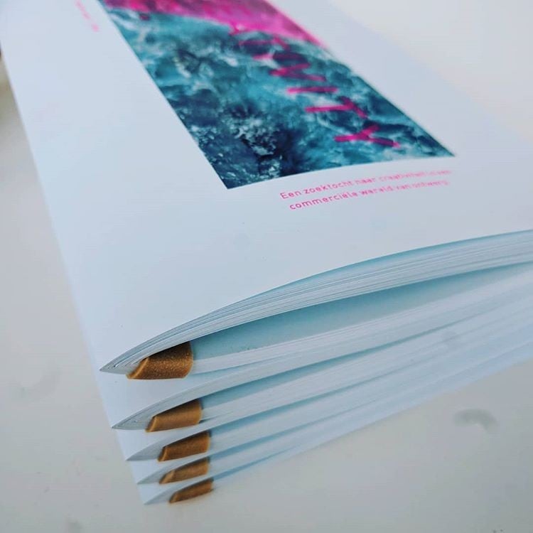
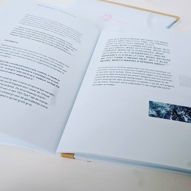
As for its design: the 90 grams blue tinted pages are only bound by an elastic band. It represents the fragile state of creativity. Images of the sea are placed at pages which contain key quotes. Essentially these quotes are the summary of the whole thesis. The light blue color of the pages represent sea water, since my idea of creativity is a comparison with the vastness, chaos and flow of sea water.
PUMBA PROJECTS
My internship took place in Amsterdam at Studio Raar. Picking the brains of the two creators Maurice and Axel and DJ WHOISJODY, was exhilarating and fruitful. They have given me many insights and I got to string along on many adventures.
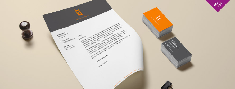
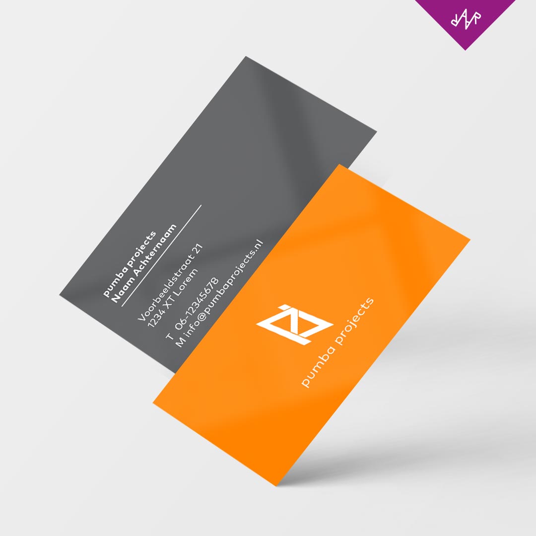
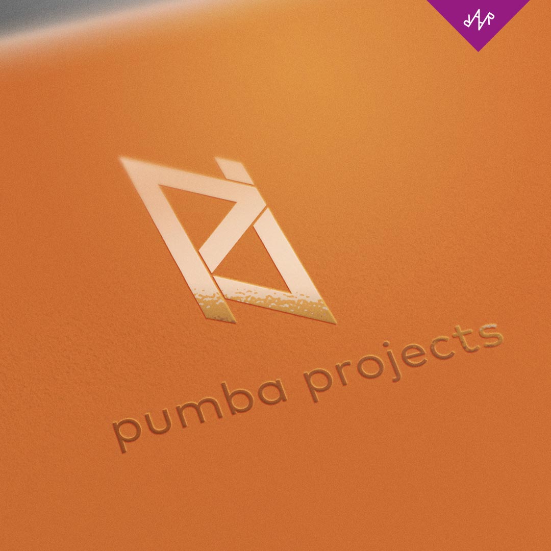
One of the projects I got to work on was a brand identity for a interim project and technical management company. Keywords to its new identity were: open, knowledge, playful, ideas, connection and hakuna matata. The logo-emblem are two stylized p's, these represent the role of connection pumba projects plays in a process. The slight slanting of the emblem stands for playfulness and the subtle lines give a small sense of depth and link back to infrastructure.
Studio Raar ©

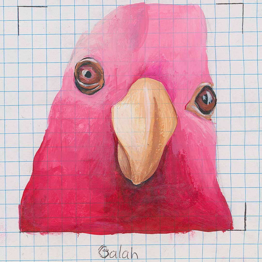
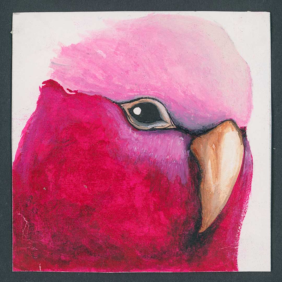
Galah Cockatoo
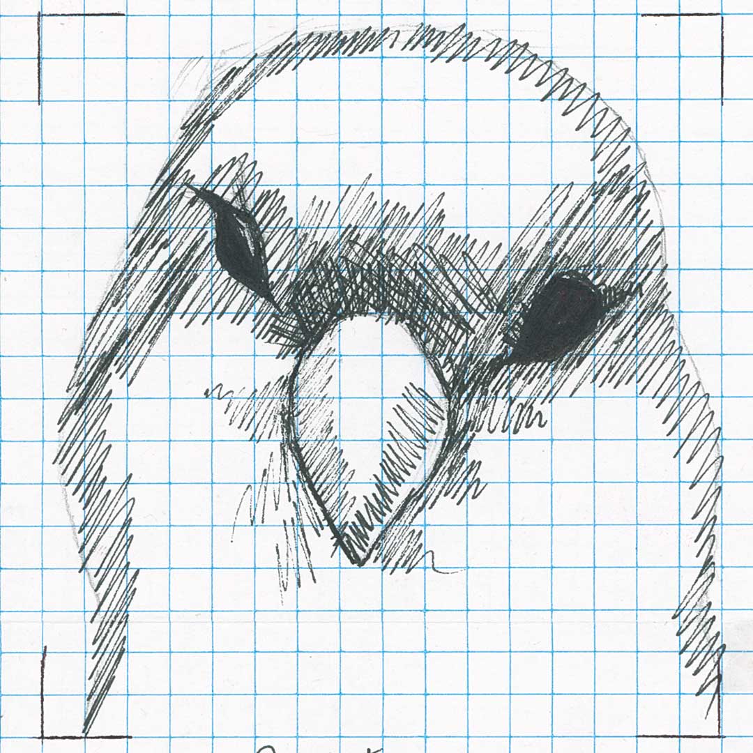
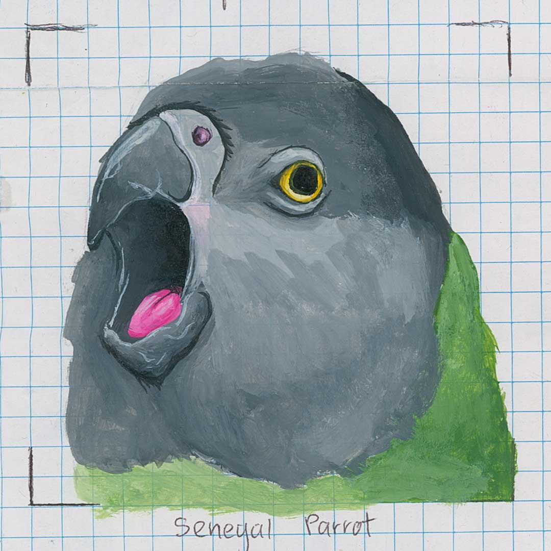
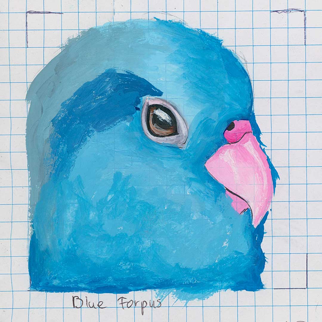
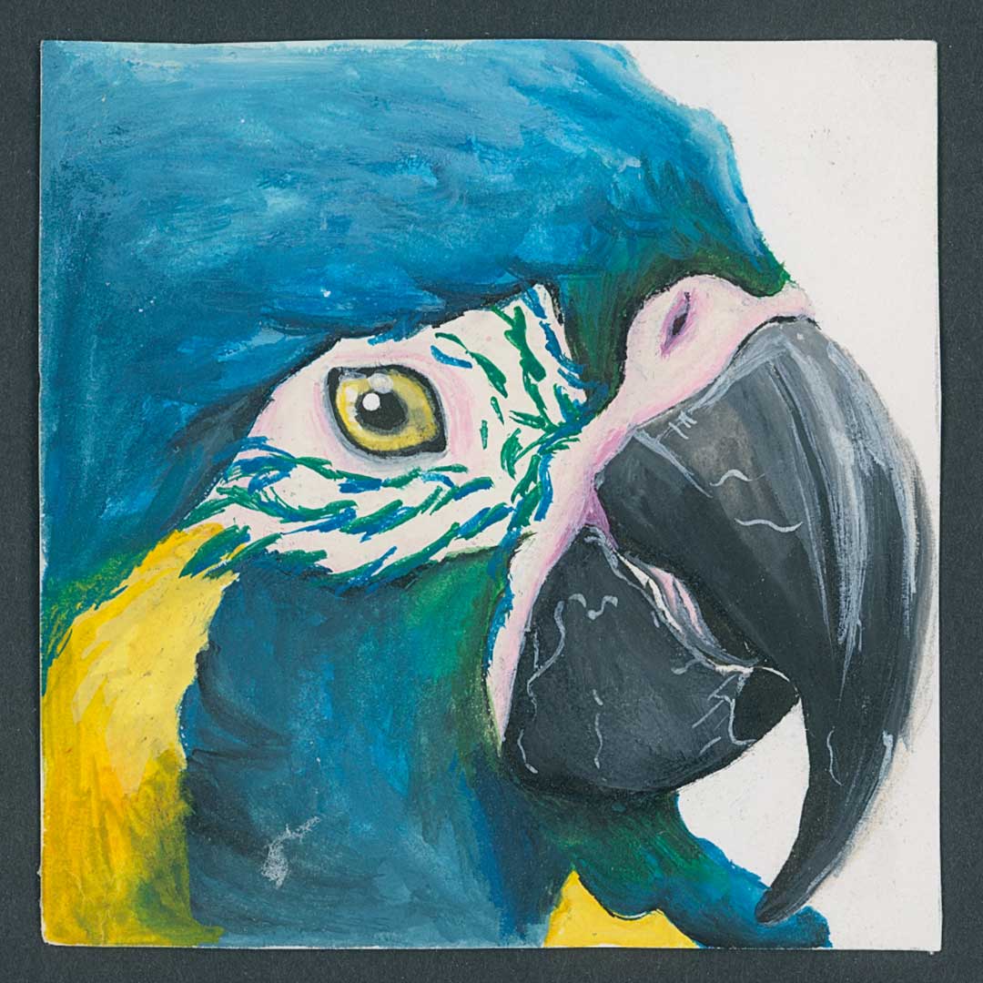
Since I do have a fascination with birds, and have this species as a pet, I wanted to make a icon set of my favorite species.

Sun Conure
I started by painting the bird species and through scanning, loaded them on to my computer. After downsizing them I noticed the grid.

Blue Forpus
When downsized the colors were reduced to squares. I could use three or four shades and different colors to give a little sense of the plumage of the bird.

Senegal Parrot
This was a process of a detailed design to a subtle one. Without taking away the recognition of the species.
FENNEC FOX
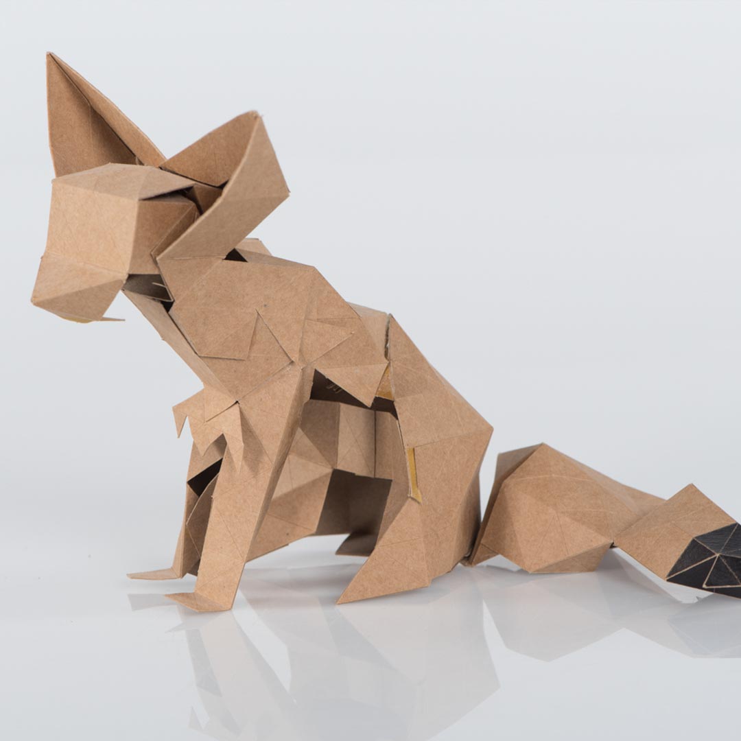
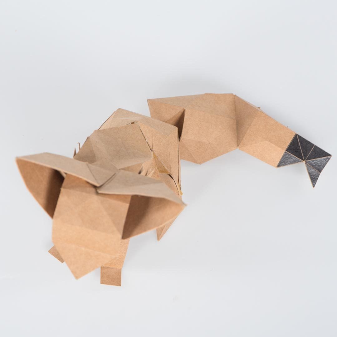
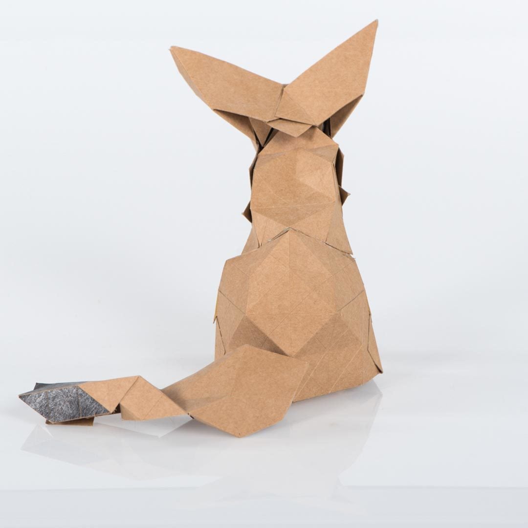
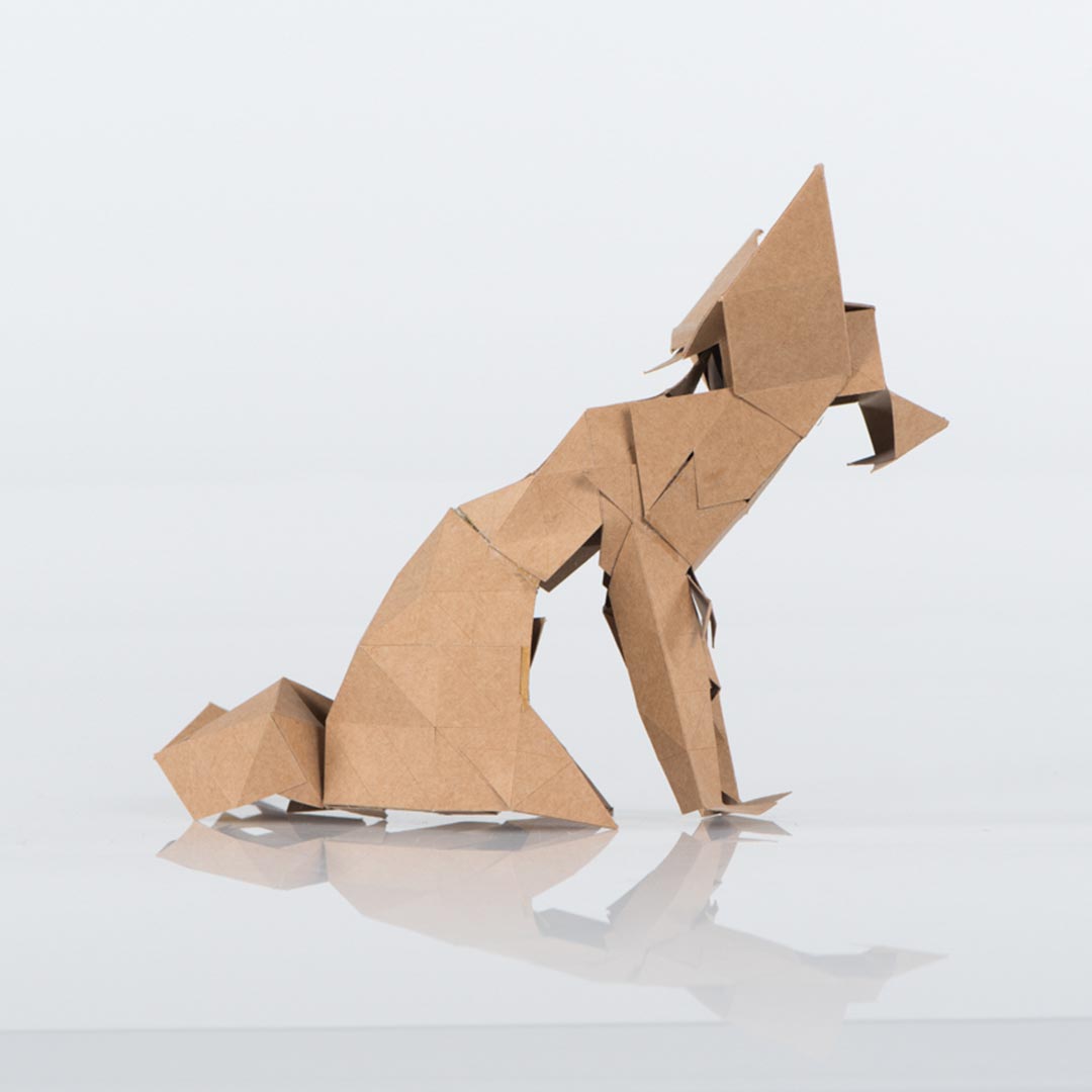
The paper model had to be about a personal
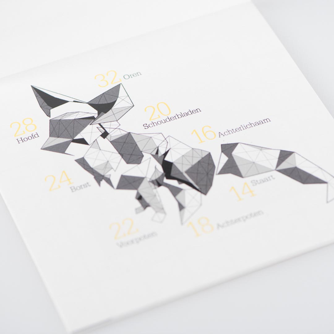
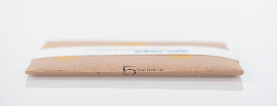
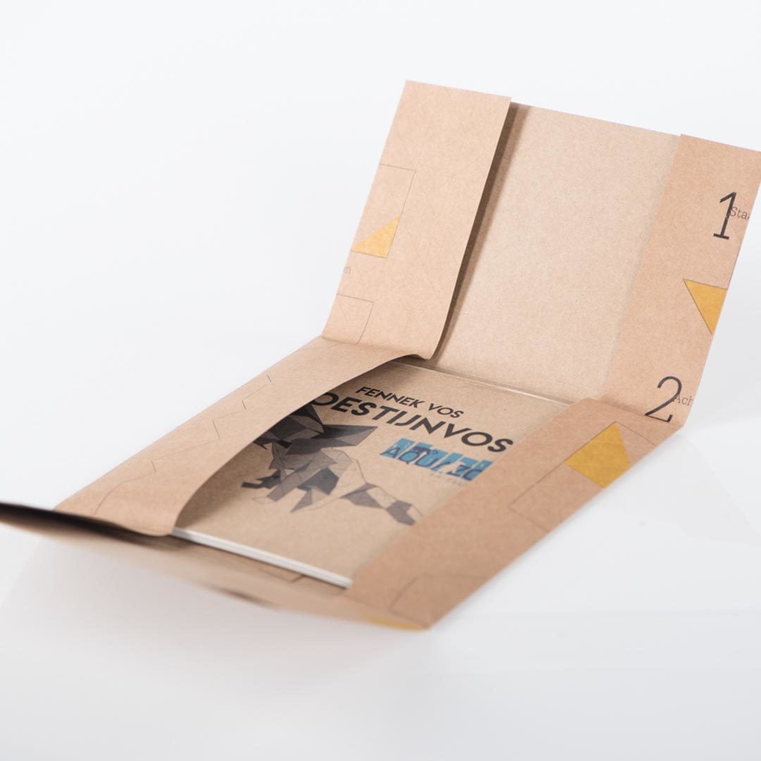
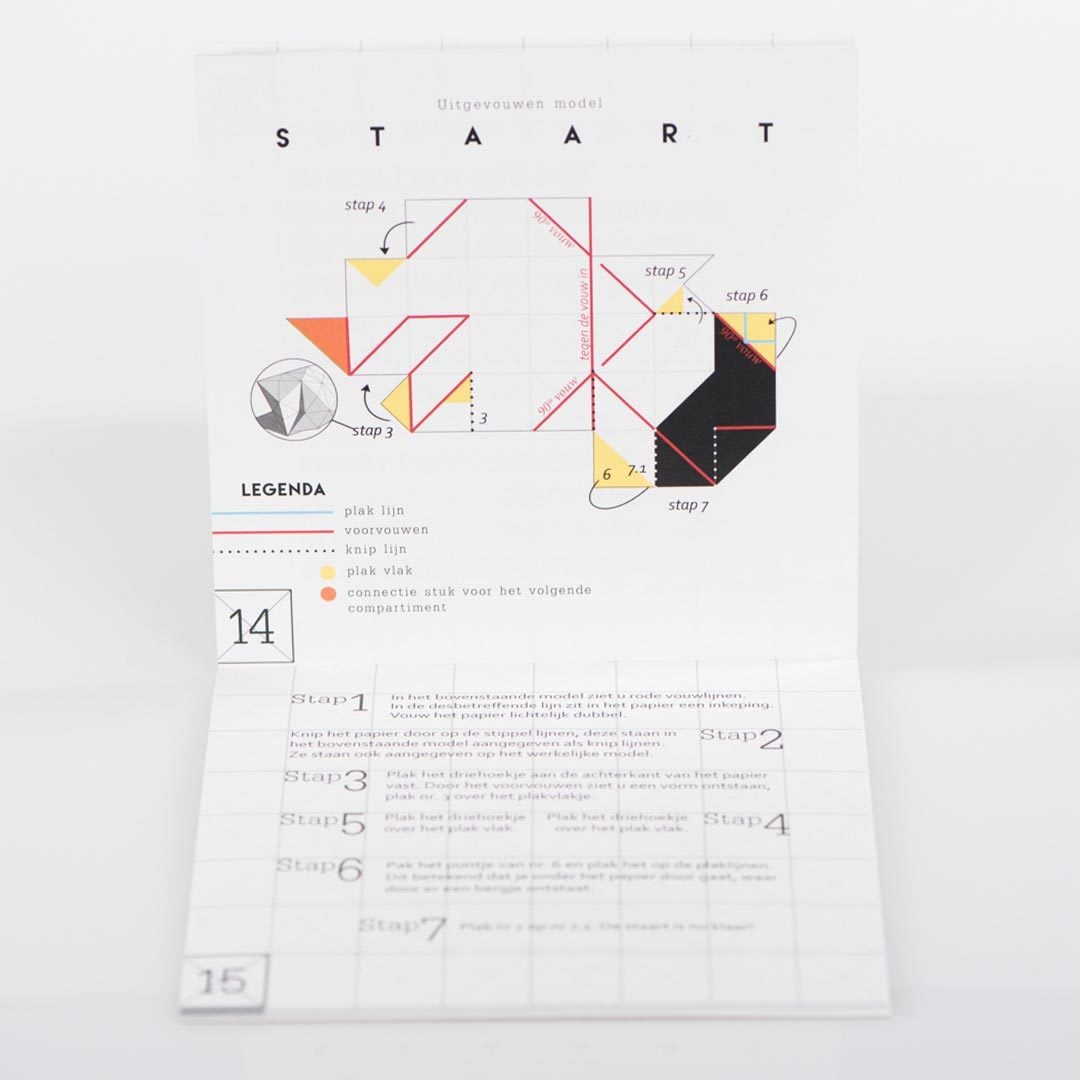
favorite animal plus an instruction manual on how to put it together. I didn’t want the user to spend a lot of time on putting the fox together, so I used a pre-cut grid. If the user made cuts and pasted plane’s together the paper would already form a certain shape.
The booklet and the model had to fit through a mailbox slot. The grid of the paper model makes it, for this reason the paper model sheet is folded around the booklet.
Y BANANA
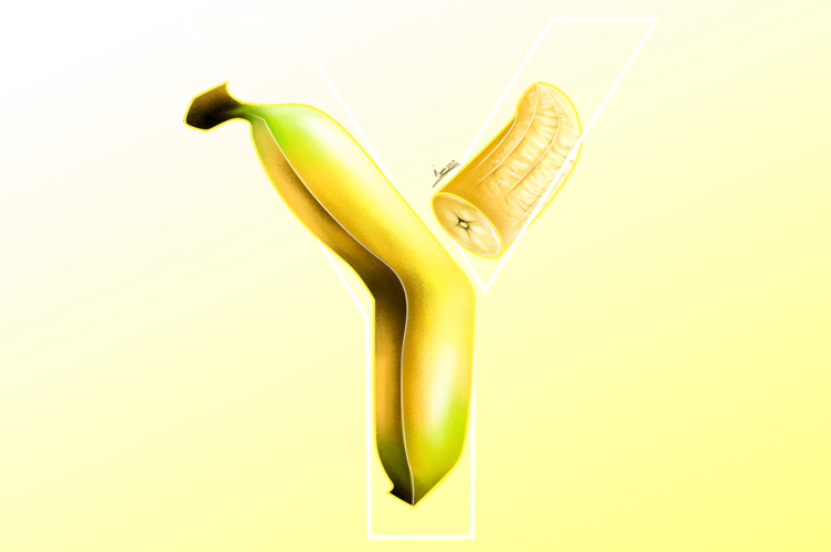
During my internship at Studio Raar I also did a lot of work for the DJ WHOISJODY. I got inspired by the letter Y of his logo and digital painted a banana.
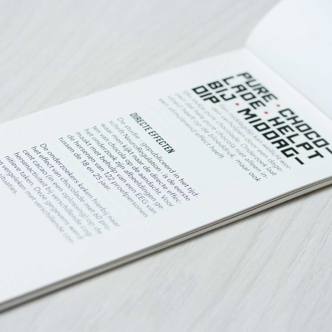
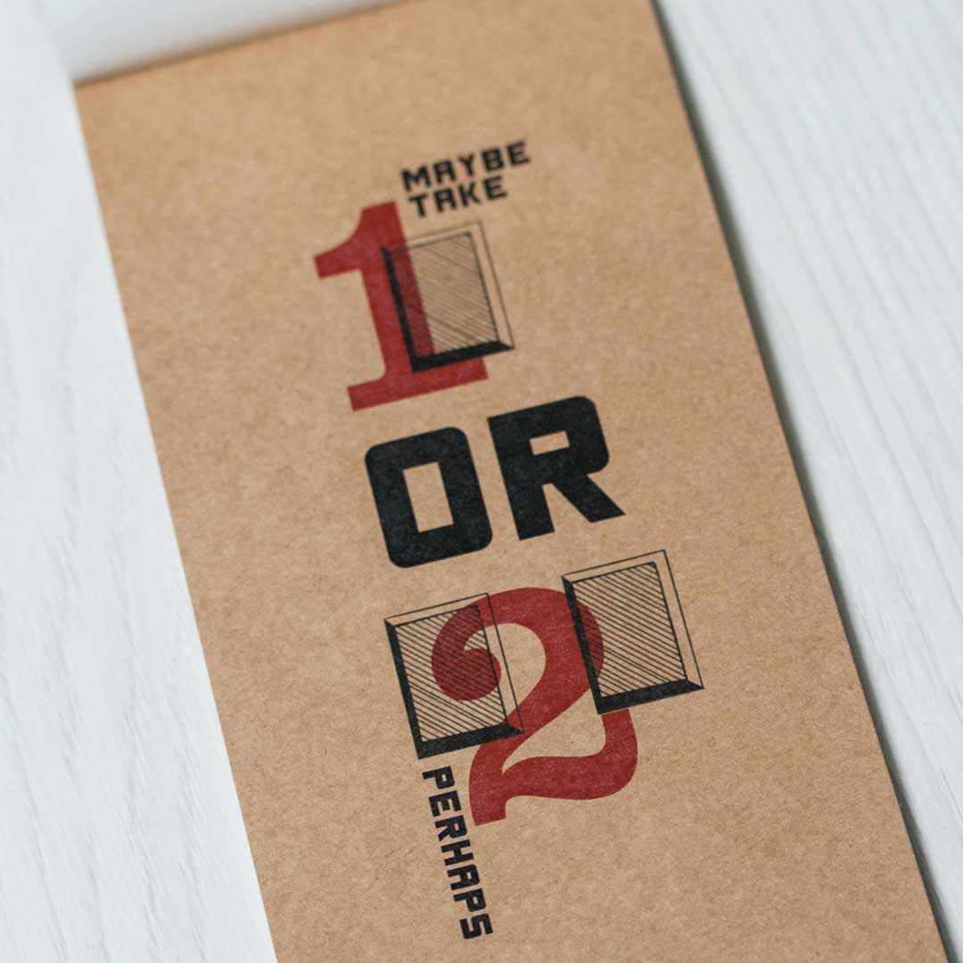
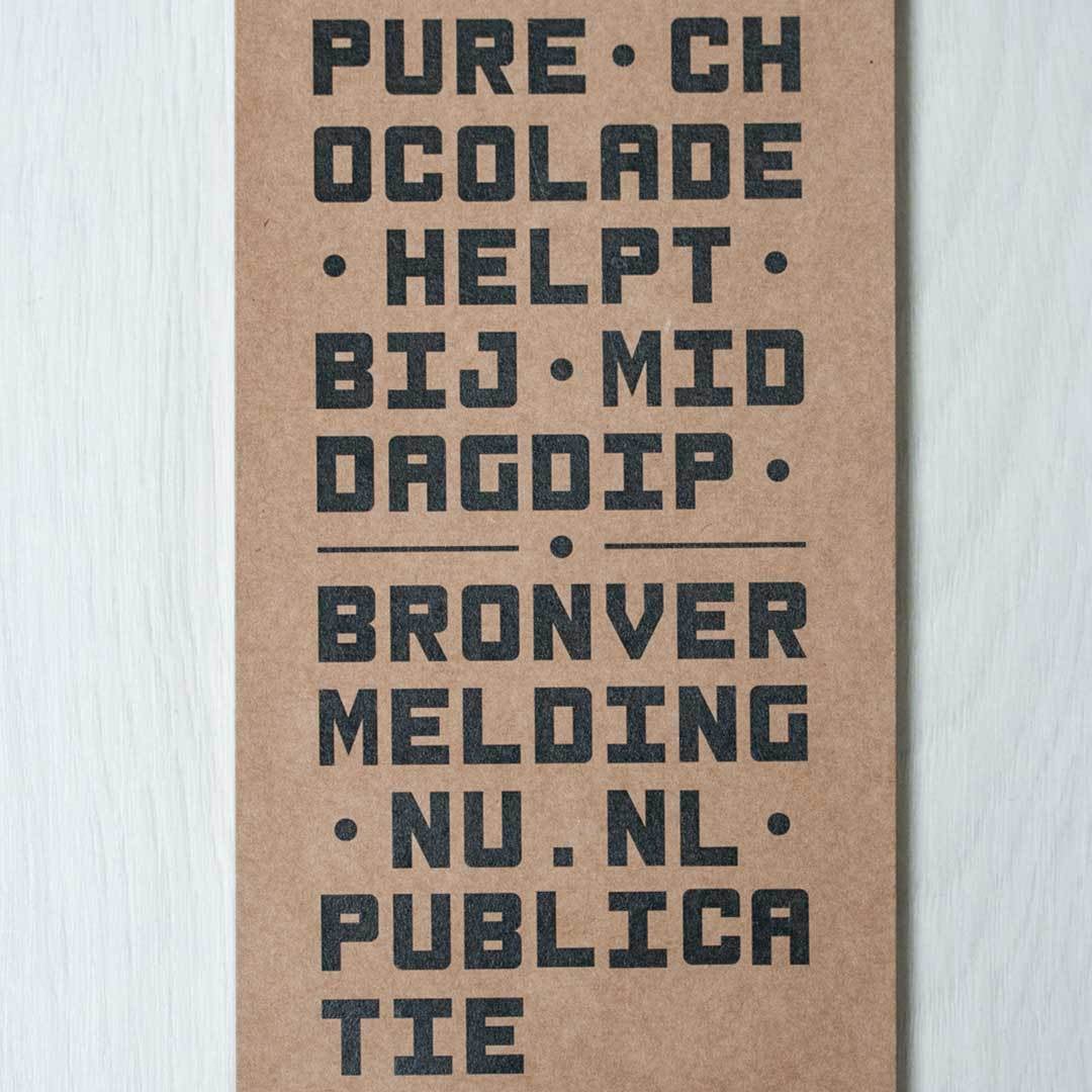
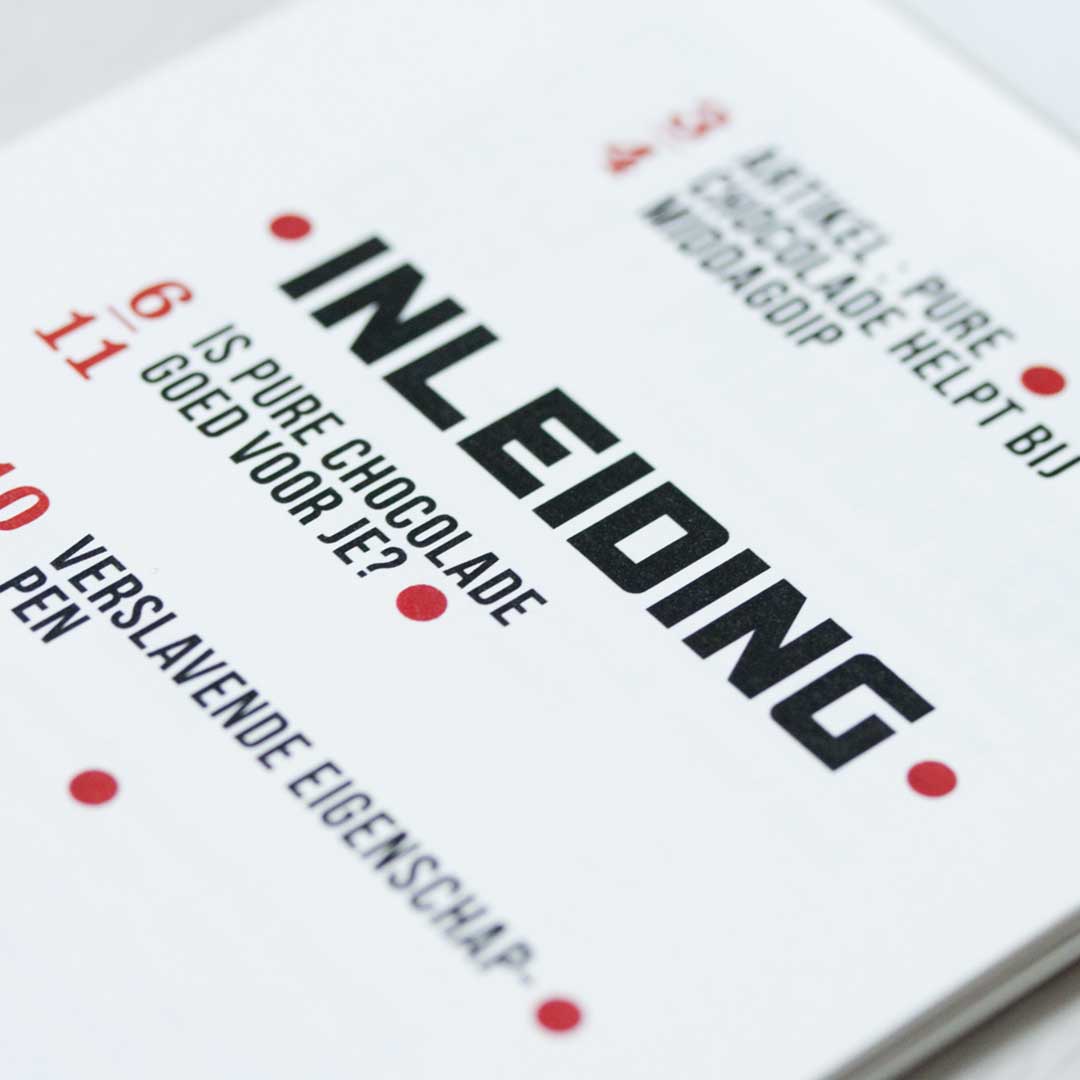
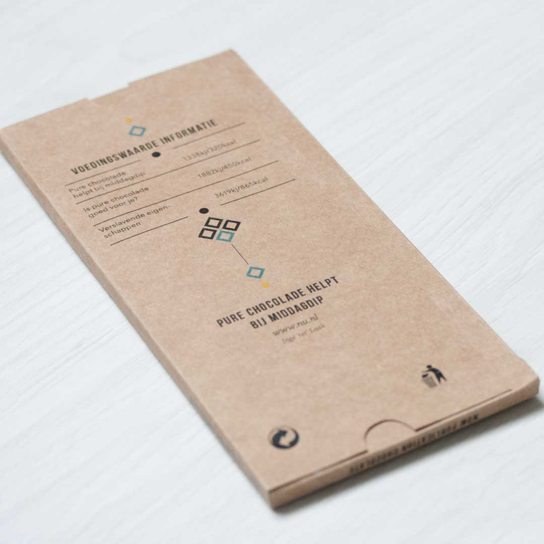
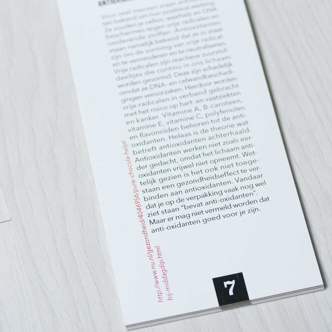
NOW PUBLICATION
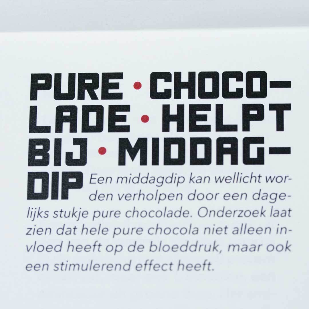
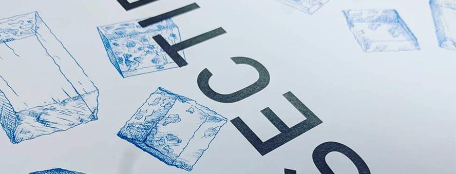
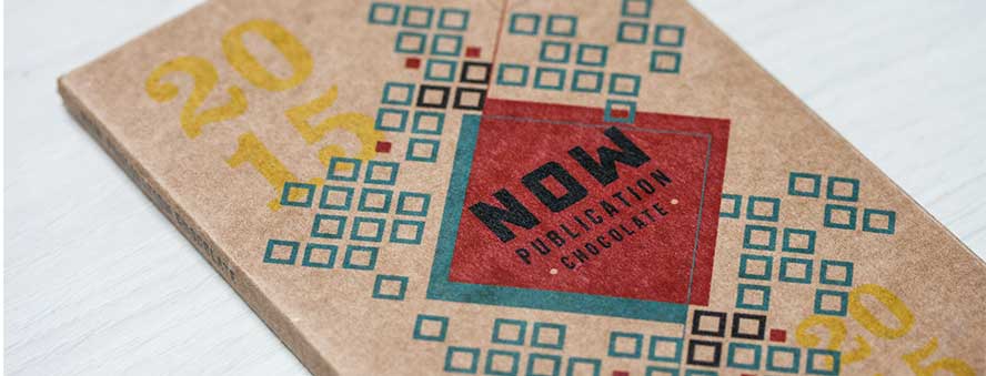
In between the articles are brown colored sheets of paper, containing typography/artwork about the subject. The header font has a rectangular character and fits into a grid. The spaces consists of dots and return in the same place on some of the pages with quotes about well, you guessed it: chocolate.